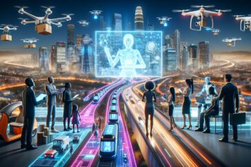
Saturday, June 25, 2005

Communicating error messages accessibly

This is a detailed recommendation for making application erros accessible ...

"I propose the following requirements for error message presentation in web applications:

Error messages should be accessible for as many users as possible regardless of culture, age and impairment.
  • It should be easy to understand that an error has occurred.
  • It should be clear what the user has to do to correct the error.
  • It should be clear for the user where the error was found in the form.
  • It should be possible to be notified about errors before submitting the form, especially if it is a complex form that takes time to process on the server.
All errors should be displayed at the same time. Noone wants to re-submit the form to find a new error."   continued ...   (Via Standards-schmandards)

Application Error - User Interface Design, Human Computer Interaction (HCI), Ergonomics

Project Management Graphics (or Gantt Charts)

An excellent analysis of Gantt Chart interfaces ...

"A look at a few of the approximately 22,000 Google hits for "Gantt chart" shows us current practice. These are my findings and conclusions:

Computer screens are too small for an overview of big serious projects. Horizontal and vertical scrolling are necessary to see more than about 40 horizontal time lines for a reasonable period of time. Thus, for large projects, print out the sequence on a big roll of paper and put it up on a wall.

The chart might be retrospective as well as prospective. That is, the chart should show actualdates of achieved goals, evidence which will continuously reinforce a reality principle on the mythical future dates of goal achievement.

Most of the Gantt charts are analytically thin, too simple, and lack substantive detail. The charts should be more intense. At a minimum, the charts should be annotated--for example, with to-do lists at particular points on the grid. Costs might also be included in appropriate cells of the table.

About half the charts show their thin data in heavy grid prisons. For these charts the main visual statement is the grid prison of administration, not the actual tasks contained by the grid. No explicitly expressed grid is necessary--or use the ghost-grid graph paper. Degrid! See The Visual Display of Quantitative Informationon chartjunk, Envisioning Information on layering and separation, and Visual Explanationson the ghost-grid graph paper. Here is an excellent bad example:"   continued ...   (Via Ask E.T.)

Gantt Chart - User Interface Design, Human Computer Interaction (HCI), Ergonomics

The Virtual Planet Explorer

Wow, when the price comes down I can see new applications with entirely new experiences ...

"A European Union program has helped several European partners to develop the Virtual Planet (or V-Planet) software, which will enable its users to browse and interact in three dimensions with any part of our planet, according to IST Results. "Using Vplanet Explorer, anyone can set off on a journey to discover new regions in 3D, rather than staring at a flat map and trying to picture its scenery," says Eric Martin, coordinator of the IST project. The software can also be used for technical simulations and has already been used by both Airbus and Boeing. It should be available this summer for about 10,000 euros (about $12K)."   continued ...   (Via Technology Trends)

Real-Time Inspection - User Interface Design, Human Computer Interaction (HCI), Ergonomics

Friday, June 24, 2005

Content management's inevitable conclusions

A good CMS discussion with model development ...

"Applying cognitive linguistics techniques to content management illuminates the constant and inevitable sources of implementation problems. These tools give us a new way of looking at content management and in turn offer us an explanation of what makes implementing CM systems so difficult.

In the course of this analysis, I’ve looked at different categories of content management: the content, workflow, and roles. Because these concepts are the building blocks of any CMS, the underlying cognitive models exert crucial influence over the systems themselves.

In general, the models are inadequate for modeling reality. But this is to be expected: they are idealized cogntive models (ICM), a set of background assumptions on how the world might work. ICMs help us account for the fact that categories aren’t perfect buckets.

These models, the ones we use for content, roles, and workflow, have something in common: an underlying model for business. In a world where content is considered product or commodity, roles are defined as discrete sets of responsibilities, and workflows are perfect processes with specific inputs and outputs, the underlying model is business is a factory."   continued ...   (Via Greenonions)

CMS Blending - User Interface Design, Human Computer Interaction (HCI), Ergonomics

Is it lazy design or stupid management decisions?

And I love to wait for PDF pages to load - even with broadband ...

"Triggered by Jakob Nielsen's reference to "lazy, stupid and evil design" in Lazy, stupid and evil design, a thread at Cre8asiteforums on the topic zeros in on the use of PDF files, when used in place of HTML pages.

The consensus is that Jakob Nielsen is correct about his rant: "Putting up PDF files is another example: "it's the lazy way out."

Someone in the thread pointed out that web developers are not to blame. Rather, it's the situation. When a company has one person handling all things related to building, marketing and maintaining the web site, there's bound to be shortcuts made."   continued ...   (Via Cre8pc)

PDF Logo - User Interface Design, Human Computer Interaction (HCI), Ergonomics


New Software Changes Wireless Technology Functions on Demand

You can imagine the new UX that will evolve from this development ...

"Taking wireless technology to the next level, NASA is leading the way in the field of Software Defined Radio, or SDR, a wireless technology that gives an electronic device the ability to quickly and easily perform new functions on demand.

Imagine an electronic gadget, like your cell phone, evolving into the next generation of communication devices through the use of radio technology. From the prospect of downloading software to adapt a cell phone into a video camera or MP3 player, to the idea that satellites could interact and share data directly by configuring themselves, the possibilities for SDR are without bound.

Researchers at NASA's Goddard Space Flight Center in Greenbelt, Md., are so enthusiastic about SDR that they have recently built an SDR test-bed — providing the necessary foundation for investigating SDR technologies and techniques. This test-bed allows for the rapid, low-cost development of communication and navigation algorithms that will be used in upcoming technology experiments, and eventually, in missions."   continued ...   (Via PhysOrg)

Calipso - User Interface Design, Human Computer Interaction (HCI), Ergonomics

Time to get used to usability

A forward looking article on accessibility and teamwork ...

"The world's ageing population makes accessible design an imperative, argues Bill Thompson.

Earlier this week Cambridge University hosted an open day where academics and some of their industrial collaborators talked about design, technology, usability and the problems that seem to emerge whenever teams of professionals from different disciplines try to work together.

It was made very clear to all of us that if we don't do something soon about making our websites, consumer goods and other technologies more accessible and straightforward to use for people across the ability spectrum then we are heading for serious trouble."   continued ...   (Via BBC NEWS)

Aging Users - User Interface Design, Human Computer Interaction (HCI), Ergonomics

Smart goggles easy on the eyes

Effective UI is not limited to computer displays ...

"When swimmers want to improve their speed in the pool, checking a wristwatch can take up precious time.

"When you're swimming, remembering how many lengths you've swum can be hard. I know that when I used to swim, I would trick myself into thinking I'd done 25 laps when maybe I'd only done 20," she says.

The information, including the total time spent swimming, the number of laps completed and the speed traveled are shown in a tiny heads-up display inside the goggle lens, using a system that reflects information off tiny mirrors."   continued ...   (Via CNN)

Swim Goggles - User Interface Design, Human Computer Interaction (HCI), Ergonomics

The Big Picture

An interesting article with future UX implications ...

"As the leader of Sony Corporation's mobile media research and design groups in Tokyo, John Poisson spent two years focused on how people use cameraphones, and why they don't use them more often. Now, he and human-computer interaction researchers Chris Beckmann and Scott Lederer are developing cameraphone software and services they hope will get the world snapping and sharing. The ubiquity of cameraphones could lead to a "whole new class of photography," Poisson says, but only if people realize that the devices are much more than the digital equivalent of Polaroids in our pockets.

TheFeature: What have you learned over the course of your research?

Poisson: People think of the cameraphone as a more convenient tool for digital photography, an extension of the digital camera. That's missing the mark. The mobile phone is a communications device. The minute you attach a camera to that, and give people the ability to share the content that they're creating in real time, the dynamic changes significantly."   continued ...   (Via TheFeature)

Camera Phone - User Interface Design, Human Computer Interaction (HCI), Ergonomics

Emails for small screens

We are getting closer to a reasonable UX for small screens ...

"This is wild. Motorola has come up with an answer to reading long emails on a cellphone or PDA with a small screen – software that automatically creates a synopsis of the long text, reports New Scientist.

"The new summarising software first discards sentences that are less than 5 words or more than 50. Then it looks for sentences containing words that frequently crop up in the text, or which the owner has added to a preference list.

Finally it sifts sentences which contain telltale words and phrases like “all in all”, “so to sum up” and “for example”. The few remaining sentences that fit all the criteria are pulled from the long message, stitched together and shown on screen.

But one risk if the system doesn’t perform as people expect is that important messages could be deleted without being fully read. “By the way, you’re fired,” might slip through the net, for example".   continued ...   (Via textually.org)

Email Screen - User Interface Design, Human Computer Interaction (HCI), Ergonomics

Better Games Through Usability Evaluation and Testing

A good article about game usability testing ...

"No one wants to play games that are either frustrating or difficult for the wrong reasons. The best way to make sure that unintended problems do not hinder enjoying the game is to take usability into account in game development. This article presents how this can be done and what kind of results to expect.

Usability is an integral part of software development and has been so for the past 20 years. For one reason or another, usability has not gained similar popularity in game development. This, however, is about to change. Ease of use and optimal user experience are already important in games and will become even more so in the future.

There are many reasons why usability is important in games. For one, playing games is voluntary. If the player has to struggle with problems that make playing less fun than doing something else, then there is nothing to stop the player from switching off the console. This is a serious risk as the user experience is very sensitive to usability problems. Even the smallest glitch or hiccup in the user interface may render an otherwise good game into a rather annoying experience. For example, if managing the inventory in a role playing game is not fluent enough or restarting a race in a driving game is tedious the player is not likely to enjoy playing the game."   continued ...   (Via Gamasutra)

Game Usability - User Interface Design, Human Computer Interaction (HCI), Ergonomics

HCI2005 Tutorials range from Project Management to Games Design

Mark it on your calander or sign-up now ...

"The 19th British HCI Group Annual Conference will be held at Napier University in Edinburgh, UK, from 5th-9th September 2005. Join researchers, practitioners and educators from around the world at HCI2005 where the conference will be exploring the theme of "The Bigger Picture".

As part of the conference programme there will be a premium number of tutorial events."   continued ...   (Via Usability News)

HCI 2005 - User Interface Design, Human Computer Interaction (HCI), Ergonomics

Thursday, June 23, 2005

ZDnet editor-in-chief on the future of user interfaces

Will we cause more problems than solution in future interface designs? ...

"ZDnet editor-in-chief Dan Farber covers the history and future of user interfaces in two minutes. Obviously, such coverage will be disappointing to anybody in the field, but what is most disappointing is that he seems to think that speech, gestures, and 3D displays will, by their very existence, improve human-computer interaction.

Like many people who are in love with technology, he thinks that interfaces in the "Green screen" era were bad because the technology was limited. Though this was an obstacle for some kinds of applications, the applications of the day that were hard to use were hard to use for the same reason that today's applications are hard to use: it's still doesn't pay for companies to make things that are easy to use.

In the early days of computers, computers allowed people to do things that couldn't be done any other way. If the user interface was not optimal, that was OK because it was better than nothing. This is still true for many applications today.

While new technologies might give user interface designers more options in the future, they are as likely to create as many problems as they solve. Mr. Farber is not helping things to suggest that usability issues will go away as soon as speech recognition improves. This is primarily an issue of how companies want to treat their customers and the attention and dollars they want to pay to people."   continued ...   (Via Usability News)

3D Display - User Interface Design, Human Computer Interaction (HCI), Ergonomics

Microsoft - User Interface Design

A good source of basic information if you have not already seen this site ...

"User experience and interface design in the context of creating software represents an approach that puts the user, rather than the system, at the center of the process. This philosophy, called user-centered design, incorporates user concerns and advocacy from the beginning of the design process and dictates the needs of the user should be foremost in any design decisions."   continued ...   (Via Microsoft)

User Interface - User Interface Design, Human Computer Interaction (HCI), Ergonomics


Web Standards Project (WaSP) Accessibility Task Force

If you are designing for accessibility, this is a group for you ...

"Accessibility is a hot topic again with many mature and interesting discussions taking place. Now the Web Standards Project (WaSP) announces the WaSP Accessibility Task Force. Bringing together accessibility specialists from across the world, the Task Force will work together with accessibilty organisations and technology vendors and others to help promote wider web accessibility."

Web Accessibility Task Force - User Interface Design, Human Computer Interaction (HCI), Ergonomics

Lazy, stupid and evil design

A cautionary interview with Jacob Nielsen ...

"Having a coffee and cake with Jakob Nielsen, the web usability expert from Nielsen Norman Group, I asked him what was holding up progress on the web. "Three things, really: I call them lazy, stupid and evil design," he replies.

"Evil design is where they stop you from doing what you are trying to do, like putting an advert over the top of the page. That's the wrong way to do it. Google has made billions by putting the ads where people do want them, rather than where they don't want them."

Evil design is perpetrated by people who are deliberately doing the wrong thing, and this harms everyone. Nielsen cites pop-up windows as an example. Users now expect pop-ups to be unwanted ads, and close them without looking at them. As a result, good designers can no longer use pop-up windows even when they would be a good solution.

"We now have to say: 'Don't put your help text in a pop-up window.' It's ruined it for everybody," he adds."   continued ...   (Via Guardian Unlimited)

Popup - User Interface Design, Human Computer Interaction (HCI), Ergonomics

Firefox users turned away from 10% of top UK sites

How many sites in the US are not accessible by Firefox? ...

"Despite the increasing use of non-Internet Explorer web browsers, such as Opera or Firefox, one in ten UK websites still fails to provide proper access to anyone not using Microsoft's default offering, a study has found.

Web-testing firm SciVisum looked at 100 high profile UK sites, including Jobcentreplus.gov.uk, and the Odeon cinema chain's online presence. Neither of the two named is accessible by non-IE browsers, the firm says, along with one other, and seven others, including British-American Tobacco's site, use non-standard web coding that is generally only recognisable to Internet Explorer."   continued ...   (Via The Register)

Firefox - User Interface Design, Human Computer Interaction (HCI), Ergonomics

Folksonomies: power to the people

A good introduction to folksonomies ...

"We have gone past a critical mass of connectivity between people that has introduced a new revolutionary ability to communicate, collaborate and share goods online.

To respond to these increased informational and exchange needs, new communication models are emerging and producing an incredible amount of distributed information that information management professionals, information architects, librarians and knowledge workers at large need to link, aggregate, and organize in order to extract knowledge.

The issue is whether the traditional organizational schemes used so far are suitable to address the classification needs of fast-proliferating, new information sources or if, to achieve this goal, better aggregation and concept matching tools are required.

Folksonomies attempt to provide a solution to this issue, by introducing an innovative distributed approach based on social classification."   continued ...   (Via Emanuele Quintarelli)

Many2Many - User Interface Design, Human Computer Interaction (HCI), Ergonomics

Wednesday, June 22, 2005

Video Recorders top List of Difficult Objects

We are all familiar with these usability problems with popular products ...

"Video recorders are the most difficult objects to use in the home, according to a User Vision survey of consumer frustration.

In a research study carried out by user-experience consultancy User Vision, setting the video to record and installing a child car seat were cited as the most popular sources of consumer frustration, followed by digital TV systems, digital cameras, washing machines, dishwashers and tin-openers.

The research asked 500 consumers to name the items in everyday life which they found most difficult to use. Difficult-to-open packaging appeared regularly in the research – particularly for such items as batteries, orange juice/milk, tinned corned beef, CDs and DVDs, razors, and Easter eggs. Adhesive tape was also a popular choice, with the inability to find the ‘end’ a major bug bear for several people."   continued ...   (Via Usability News)

Video Recorder - User Interface Design, Human Computer Interaction (HCI), Ergonomics

Sites for sore eyes

Students rate the usability of university websites. Lots of lessons learned ...

"Too many clicks and you've lost them. Nowhere is the culture clash between today's sixth formers and the universities trying to recruit them greater than in academic websites.

As universities begin to gear up for this summer's Clearing season, when they hope to field inquiries from thousands of candidates still without a place, a piece of market research shows just how out of touch many of them are. They are, in a word, too academic, full of swaths of information that leave web-surfing students bored and irritated. That is the verdict, at least, of a company that sat down two groups of first-year sixth formers and asked them to find information on university and college websites.

The sites that scored highest on first impressions were Oxford Brookes, Hull, Lincoln, St Martin's College and Kingston. Most sites fell into the "all right" category, says Travers. "The overall impression is one of dull mediocrity. Most sites loaded up quickly and contain a wealth of information, but none of them seems to engage our researchers." The students complained of too much text and not enough pictures, and said the sites did not give a "real" impression of what the place was like."   continued ...   (Via EducationGuardian)

London Metropolitan University - User Interface Design, Human Computer Interaction (HCI), Ergonomics

CHI 2006

CHI 2006 - User Interface Design, Human Computer Interaction (HCI), Ergonomics

AJAX Interface Design

A good list of Ajax benefits ...

"Now as a flurry of interest in AJAX sweeps the Web, it’s worthwhile to consider the design implications of this technology lest we end up with “Skip AJAX” in the future.
  • Fast & Incremental
  • Communicating Change
  • Lessons from the Desktop
  • Keeping Conventions"
   continued ...   (Via LukeW)

Ajax Overview - User Interface Design, Human Computer Interaction (HCI), Ergonomics

OS X Widget Designer's Checklist

A good checklist for OS X widget designers

"What spurred me to eschew widgets to begin with is the catch-22 they present: easy to build equals more folks can produce them (wonderful), but easy to build also equals opportunity for poorly thought out ideas to be built (not so wonderful). With a desktop app, the investment in time and money to build is much greater, and so, more likely to be carefully considered - and of course we all know that even that barrier doesn’t put a harness on bad products.

So, with that in mind, I thought I’d put together a widget designer’s pre-launch checklist:
  • Are the features in my widget more easily accessible elsewhere?
  • Calculator widget fails, but clock passes because multiple clocks can be used for time-zone comparison
  • Can the exact functionality of my widget be found as part of a free desktop application? (e.g. showing song title from iTunes)
  • And More"
   continued ...   (Via wg)

Dashboard - User Interface Design, Human Computer Interaction (HCI), Ergonomics

Create Value By Relinquishing Control

Getting closer to a control philosophy ...

"My latest essay is up on Adaptive Path's site: "How I Learned to Stop Worrying And Relinquish Control." The thesis is that the more control companies give up, the greater value they receive in return.

As I started writing that essay, I thought I'd write more of a diatribe against designers who feel that controlling the user's experience is the point of their work. While I have a dig at that perspective in the paragraph on the interactive design competition that Jeff wrote about, the essay took a decidedly different tack, trying to come to grips with the more fundamental concept of control.

The problem was, I end up using 5 or so different types of control, and I don't really call them out distinctly. This was a nagging thing in the back of my mind as I was writing the essay, and didn't really become clear to me until after I had turned it in, and talked about it with others in Adaptive Path.

I'll go example by example...

Google's relinquishes behavioral control. Instead of trying to create "stickiness" that keeps you clicking into their site, they instead try to provide the best results to your queries, wherever that might lead. I find it impressive that, if you type an address into the Google search engine, you a link not only to Google Maps, but Yahoo and Mapquest as well. You prefer the competitors? Fine! Enjoy!"   continued ...   (Via peterme)

Control Planes - User Interface Design, Human Computer Interaction (HCI), Ergonomics

Pop-Ups Pose Phishing Threat to Web Users

So much for pop-ups ...

"Jupiter Research analyst Joe Wilcox told TechNewsWorld that if online consumers had good surfing habits, then vulnerabilities like this one wouldn"t be much of an issue. "The bottom line is if anything pops up while you are on the Web and you didn"t initiate the action, close that window," he said. "It"s as simple as that."

Phishers could exploit a vulnerability in several popular Web browsers, according to a report from security research firm Secunia. The flaw would allow cybercriminals to steal personal information from its victims. Specifically, malicious Web sites could spoof pop-up boxes in Internet Explorer for both Mac and Windows, Opera, Safari, iCab, Mozilla , Firefox and Camino browsers."   continued ...   (Via PhysOrg)

Pop-up Ad - User Interface Design, Human Computer Interaction (HCI), Ergonomics

Accessibility vs BlindSurfer

Accessibility is more than designing for visually impaired users ...

"A couple of interesting posts over at Veerle’s blog show what can happen when only vision impaired users are catered to. In Accessibility, Veerle’s point of view, Veerle noted that her home town’s website has been approved by the BlindSurfer organisation even though the “HTML” is a complete FrontPage generated mess, about as bad as it can get. There was A response from an accessibility consultant from BlindSurfer which makes an interesting read.

I’ve said this before: focusing only on blind and vision impaired users is not the way to go. Accessibility is about all web users. I find the site in question, www.deinze.be, just barely accessible and usable, and I am fully abled and use a graphical browser on a desktop computer. I also tried using the site with VoiceOver and sure, it’s possible to get around, but the frames and missing alt attributes make it really hard.

This kind of label of approvement is bad for the overall health of the web."   continued ...   (Via 456 Berea Street)

Frames Web Design - User Interface Design, Human Computer Interaction (HCI), Ergonomics

User Interface the New Focus in Digital Music Player Design

Unitl now, if you have seen one, you have seen them all ...

"As more and more MP3 player makers improve their devices' external design, the user interface is becoming an important differentiating factor, the chief executive officer of one of the world's biggest MP3 player makers said Wednesday.

"It's hard to differentiate by design," Yang said in an interview at the SEK exhibition in Seoul on Wednesday. "We thought, 'Why do we need control buttons? Controls are ugly, so if it's possible to eliminate them and use the display [we should do that].'"

The first results of this thinking can be found in the IRiver U10, which was announced on Monday and made its public debut on Wednesday.

The U10 does away with most of the control buttons found on typical MP3 players in favor of a pressure-sensitive front panel. The panel can be pushed in four areas, each at the middle of the panel's four sides, to control the device. The function performed by depressing each part of the panel changes depending on the menu, and the current functions are clearly shown on the display itself."   continued ...   (Via PCWorld)

iRiver U10 - User Interface Design, Human Computer Interaction (HCI), Ergonomics

Design Cliches

These symbols have been used a lot over the years. Perhaps too much? ...

"This post is about those symbols we use … or rather, those other people use … to indicate common themes, concepts or ideas. Those symbols which have been used so often that they’ve become clichés. I warn against using them: or challenge designers to breathe new life into their rotting corpses. Welcome to the land of the living dead.

Hopelessly Dead - The Lightbulb

It’s burned out. Should not be used to indicate ideas, innovation, intelligence … If this is your bright idea, you’re not very bright. Could be used to indicate: light"   continued ...   (Via Speak Up)

Light Bulb - User Interface Design, Human Computer Interaction (HCI), Ergonomics

Modelling embodied experience

Speed in going from prototype / wireframe testing to a real world form factor is important ...

"Matt Jones notes the efficacy of Flash Lite for prototyping - as recently demonstrated to him by the team at Fjord:

"If you don’t polish the visual aspects, keeping it at a 'wireframe'-like level of detail - then you almost have an ‘animatic’ of the experience that you can put in the hands of a prospective end-user; which also you can quickly pull apart, reconfigure and test again. This should result in iterative improvements to the design which you can then take to the next level - coding."

In building digital experiences, we don't have to remain too long in the abstracted modeling world - we can move to the situated, embodied world very quickly indeed. Rapidly getting prototypes on to the phone means evaluation and iteration can have a finer grain from the start."   continued ...   (Via cityofsound)

Wireframe - User Interface Design, Human Computer Interaction (HCI), Ergonomics

Tuesday, June 21, 2005

Times Online Search Search Search

Another good one from the UI Hall of Shame ...

"Check out the Times Online website, it provides a pretty woeful little user interface for searching.

First, of course, you have to type in your search term on their Home Page, after that a new Browser Window pops up wanting to know whether you want to search THEIR web site or the Whole Web (duh), next your results pops up in yet ANOTHER Browser Window. When you click on one of your results you end up with ANOTHER browser window for the result you clicked on.

So by the time you get to your article you have FOUR Times Online browser windows open."   continued ...   (Via UI Hall of Shame)

Times Search - User Interface Design, Human Computer Interaction (HCI), Ergonomics


The Register has Fun with a Robot gone Wild

HCI can be a dangerous thing ...

"Robot runs riot at California hospital" tells the story of human-computer interaction gone barmy as a 'robotic nurse threw off its shackles and went on the rampage' and 'the crazed automaton – reportedly the size of a good-sized TV, which in California means it must be at least the size of the average British garden shed - careened past the drug depository before barging into a room in the hospital’s radiation oncology department where an examination was in progress. The psychotic pill pusher reportedly refused to leave, sending both doctor and patient fleeing for their lives.'

The Register kept its tongue in its cheek in anthropomorphising the behaviour of the robot - in other words, they gave it human qualities, probably rather as the human players in the hospital drama did.

However, not everyone shared their sense of humour. See Machine defends rampaging robot, where The Register reports on the irate letter they got: 'The current state of robotic technology or artificial intelligence is not such that a robot could REFUSE to do anything. Do not report such garbage to your readers."   continued ...   (Via Usability News)

Robot Pill Pusher - User Interface Design, Human Computer Interaction (HCI), Ergonomics

Strategy by Design

A wise strategy for anyone involved in the design process ...

"In order to do a better job of developing, communicating, and pursuing a strategy, the head of Ideo says, you need to learn to think like a designer. Here's his five-point plan for how to make the leap.

It's remarkable how often business strategy, the purpose of which is to direct action toward a desired outcome, leads to just the opposite: stasis and confusion. Strategy should bring clarity to an organization; it should be a signpost for showing people where you, as their leader, are taking them -- and what they need to do to get there. But the tools executives traditionally use to communicate strategy -- spreadsheets and PowerPoint decks -- are woefully inadequate for the task. You have to be a supremely engaging storyteller if you rely only on words, and there aren't enough of those people out there. What's more, words are highly open to interpretation -- words mean different things to different people, especially when they're sitting in different parts of the organization. The result: In an effort to be relevant to a large, complicated company, strategy often gets mired in abstractions.

Here is Ideo's five-point model for strategizing by design.
  • Hit the Streets
  • Recruit T-Shaped People
  • Build to Think
  • The Prototype Tells a Story
  • Design Is Never Done"
   continued ...   (Via FastCompany)

Design Thinking Quote - User Interface Design, Human Computer Interaction (HCI), Ergonomics

Apple sued over iTunes software interface

Be careful out there ...

"Contois Music Technology last week asked a Federal Court to stop the iPod maker from distributing its iTunes jukebox software and is seeking damages over an alleged patent violation by the iTunes software.

According to the suit, persons who were at the time employed by or later became employed by Apple were present at both trade shows and viewed Contois' software. The suit charges Apple later "copied" the invention and used the design ideas in the interface for its iTunes software.

Specifically, Contois documented 19 interface aspects of the iTunes software that it claims are in direct violation of Contois' patent. These areas include iTunes' menu selection process to allow the user to select music to be played, the ability of the software to transfer music tracks to a portable music player, and search capabilities such as sorting music tracks by their genre, artist and album attributes."   continued ...   (Via AppleInsider)

iTunes Store - User Interface Design, Human Computer Interaction (HCI), Ergonomics

Mobile Service Discovery: It's All About Usability

Some practical tips for designing a mobile interface ...

"One constant is lurking in mobile data land and it is the problem of usability. People have been quoting Nielsen's seminal work for many years but 'service discovery' remains the bugbear of mobile data services. Trying to use Google or Yahoo mobile is a deeply disappointing experience - awkwardly type in a search term and get back hundreds of unusable results. Many operators' portals are as uninspiring to navigate as reading an industrial parts catalogue. It is as if 30 years of human-computer interaction studies have been skipped. Some operators even issue printed maps to guide customers on how to navigate around their portals.

The same old Web browser and keyboard-centric paradigms are rolled out and applied to a 10-square-centimeter screen without an efficient input device. Hierarchical navigation is a defunct paradigm for mobile mass-market services -- it's time for some new thinking.

Some rules of thumb:
- If anything takes more than 4 clicks on a mobile, it probably isn't going to happen.
- 10% of mobile content gets 80% of hits. The long tail doesn't get traffic via hierarchical navigation.
- People can't/won't change their phone settings.
- Usability issues don't go away because you have faster access."   continued ...   (Via TheFeature)

PDA Display - User Interface Design, Human Computer Interaction (HCI), Ergonomics

New Mercedes S Class Unveiled

Here is what a little usability testing along with a focus on "perceptive psychology" can buy for you ...

"... the cockpit not only conveys a feeling of safety, but is also extraordinarily well laid-out and practical – from the very first moment, man and vehicle enter into a harmonious relationship in the new S-Class. That is also assured by the newly developed and thoroughly tested operating concept. This is based on findings from extensive ergonomic and perceptive psychology studies, and also takes into account the results of acceptance tests with Mercedes customers around the world.

The major characteristic of the intelligent operating concept in the new S-Class is rapid access to functions which are used particularly frequently. The system is therefore specifically designed for redundancy: depending on his preferred habits, the driver is able to control functions such as the radio, TV-receiver, CD/DVD changer, telephone and navigation system either using conventional switches, via buttons on the multifunction steering wheel or with the help of the improved COMAND system. The direct-selection switches in the centre console are so ergonomically positioned that the driver is able to operate them conveniently and without looking down. It is also possible to operate the standard automatic climate control system in two different ways: via COMAND or using an attractively styled array of switches beneath the air vents.

The steering wheel and instrument cluster are the primary areas in the new operating concept. These integrate all the important information and functions required by the driver. The centrepiece is a colour screen with the latest display technology for a bright, crystal-clear image. The lower edge of the cockpit display has a plain-text array with which up to seven main menus for individual settings, display modes and operating functions can be controlled, depending on the level of equipment. For rapid selection of these functions Mercedes-Benz has developed the controls on the standard multifunction steering wheel further, using circular, illuminated five-way buttons which the driver operates by light thumb pressure."   continued ...   (Via WorldCarFans)

Mercedes S Class - User Interface Design, Human Computer Interaction (HCI), Ergonomics


Investigating the human role in existing and emerging technologies

"Human Technology" is a new, online, free journal with excellent content. The topics put HCI in the larger context of how people use technology and interfaces ...

"Continually evolving information and communication technologies (ICTs) touch nearly every aspect of our contemporary life. On the other hand, development of these modern technologies is closely intertwined with human practices and social innovations. The human-technology interaction and the human role in different technologies needs constant investigation, investigation that is highly interdisciplinary and multidisciplinary in its nature. Human Technology is a new, scholarly online journal that provides an outlet for this kind of essential research and scientific discussion.

Human Technology presents innovative, peer-reviewed articles that explore the issues and challenges surrounding the human role in all areas of our ICT-infused societies. The journal seeks to draw research from multiple scientific disciplines with an eye toward how applied technology can affect human existence or how it can, for instance, foster personal development and enhance research and development in industry, education, communication and other fields. Human Technology's dynamic and forward-looking articles are intended for use in both the scientific community and industry and the journal does not set any limits regarding the specialization of its authors. The journal welcomes also difficult or controversial topics, and is interested in publishing non-paradigmatic and non-traditional ideas that meet the criteria for good scientific work."   continued ...   (Via Human Technology)

Human Technology Journal - User Interface Design, Human Computer Interaction (HCI), Ergonomics

Common Industry Standard for Usability Reports

We discussed the CIS in an earlier article. This is a nice brief explanation of the CIS and its use ...

"The Common Industry Standard is an open standard for how usability reports should be structured. Similar to the academic style of reporting, there are nonetheless important differences. For academics wanting to get up to speed with how the industry would like their information, this article should help."   continued ...   (Via Milui HCI/Usability Articles)

Common Industry Standard - User Interface Design, Human Computer Interaction (HCI), Ergonomics


A Brief History of Human Computer Interaction Technology

This is an excellent historical review of HCI with a good set of references ...

"This paper tries to briefly summarize many of the important research developments in Human-Computer Interaction (HCI) technology. By "research," I mean exploratory work at universities and government and corporate research labs (such as Xerox PARC) that is not directly related to products. By "HCI technology," I am referring to the computer side of HCI. A companion article on the history of the "human side," discussing the contributions from psychology, design, human factors and ergonomics would also be appropriate."   continued ...   (Via Brad A. Myers, Carnegie Mellon)

First Mouse - User Interface Design, Human Computer Interaction (HCI), Ergonomics

Monday, June 20, 2005

If some Software Developers built houses

An interesting HCI analogy ...

"David John Burrowes, one of the Interaction designers here at Sun, sent out a pointer to a piece in the UI Hall of Shame blog by Duncan Margetts, entitled If some Software Developers built houses?. It's worth sharing with y'all. Be sure to read all the comments. You see that what is considered a good design in one situation, doesn't always work in others.

I've been writing graphical software for 23 years and working with HCI (Human Computer Interaction) people (or whatever they are calling themselves this week) for about 15 years. I've worked with good ones and I've worked with, um, not so good ones. When they are good, it's a pleasure to work with them. Each person (the developer and the HCI designer) takes a passionate interest in trying to get it right. Great teamwork. Also when working on some software within the confines of a larger project (such as the DeskSet software within OpenWindows or desktop applications for the GNOME desktop), there are usually a set of HCI guidelines that help developers and UI designers do the right consistent thing.

But what about the same application across different larger projects? I wrote the calculator application ( calctool) in OpenWindows. The same code was the basis of the calculator in CDE (although I didn't write that), and now the same code has been the basis of the default calculator for the GNOME desktop. Each time, a different UI designer has been involved and each time, the look and feel has been different. Still, no matter how you look at it, they are all better then what I came up with, circa 1987. I don't know what I was smoking then, but ooh the colors man! (Looks like HP might still be making this version available)."   continued ...   (Via Rich Burridge's Weblog)

Bad Software Design - User Interface Design, Human Computer Interaction (HCI), Ergonomics


Large Users Hope for Broader Adoption of Usability Standard

Usability reporting for software products would put a new emphisis on UI ...

"Badly designed software is costing businesses millions of dollars annually because it's difficult to use, requires extensive training and support, and is so frustrating that many end users underutilize applications, say IT officials at companies such as The Boeing Co. and Fidelity Investments.

Despite those problems, most CIOs remain unaware of a 3-year-old standard designed to help IT managers compare the usability of software products, Boeing's Keith Butler and Fidelity's Thomas Tullis both said last week.

But they and others believe that will change once the guidelines for reporting usability test results are approved as a worldwide standard by the International Standards Organization in Geneva. The ISO's technology standards committee voted late last month to accept the standard, which is known as the Common Industry Format for Usability Test Reports, or CIF.

CIOs and other IT executives need to ask vendors for CIF-compliant reports as part of their requests for proposals on software contracts, according to participants in the standards initiative."   continued ...   (Via Computerworld)

Usability Report - User Interface Design, Human Computer Interaction (HCI), Ergonomics

Firefly Mobile

A simple UI for kids. We need more like this for adults. The setup needs work, but they must wrongly think that's OK because an adult does the setup ...

"The Firefly is a unique device. Its small form factor and light weight, as well as its "cuteness" and flashing lights and colors, make it a potential success with children. The fact that it is available on pre-paid plans, and that calls can be restricted, means that parents won't have to worry about huge surprise phone bills at the end of the month.

The UI is a bit clumsy to use, as you might expect from a phone with so few keys. The menu is accessed serially, meaning that you are given the chance to enter each options menu in sequence. You can't just select the menu you want, or move back to a prior menu. In order to get out of the menu you have to keep hitting "Next" (red/right button) until it becomes "exit". Then, and only then, can you exit the menu system. Kinda crazy. They would have done well to have made use of the volume and fireworks buttons for navigation, letting you go back and forth as you like.

The user interface needs some work, to be sure, but at least with a phone this simple, you don't need to be rummaging through the main menu very often. I think that if the menu PIN and some of the flashing lights and animations could be disabled, that this device would work equally well for grandparents and other people that merely want a phone for emergencies and a few random minutes a month. But that's a different target audience completely."   continued ...   (Via MobileBurn)

Firefly UI - User Interface Design, Human Computer Interaction (HCI), Ergonomics

Bottom-Up, Whole System, Sustainable Design gets a Plug

An intriguing discussion and book about what the future might hold - including HCI ...

"It was an impassioned John Thackara of Amsterdam-based Doors of Perception, launching his book "In the Bubble: Designing in a Complex World", that addressed a mixed audience at the Design Council, London. Doctors and care workers had joined art school lecturers and HCI specialists to hear his trademark ideas for bottom-up, sustainable, people-centred design. They were not disappointed.

'Enable human agency,' he began, outlining his principles and suggesting that, however implicitly, these are principles that we all share. Criticising the idea of disintermediation and its new metamorphosis as the self-service economy, he talked about design to enable sharing, giving the example of the 'walking bus' idea that now gets children the world over to school without cars and with only a couple of parents, on rota, in attendance. He advocated taking into account the whole system and looking for solutions that were closer rather than faster, arguing for decreased mobility, all things being equal (which, he added, they are not)."   continued ...   (Via Usability News)


In the Bubble : Designing in a Complex World


Recommended Book


Check-out more books at Usernomics.

Sunday, June 19, 2005

Selecting an Intranet Search Engine

A good white paper that requires free registration to read the whole report ...

"An effective search tool on an intranet can make an enormous difference to its usability. In fact, usability expert Jakob Nielsen found that "Poor search was the greatest single cause of reduced usability across intranets". A good search engine ensures that users find what they're looking for, first time, regardless of the format or location of the information. This means that a wide variety of information can be effectively dispersed and made available to staff, without the need for complex navigation systems or filing conventions.

The following topics are covered:

1. The Basics - Objectives
2. Data Sources & File Types
3. Technology Environment
4. Features
5. Installation and Maintenance
6. Pricing Structure
7. Vendor Credentials"   continued ...   (Via InformationWeek)

ISYS - User Interface Design, Human Computer Interaction (HCI), Ergonomics